Case Study: The Hideaway
A Totally Rad, Surfer-Inspired Bar in the Heart of Atlanta
Project Overview
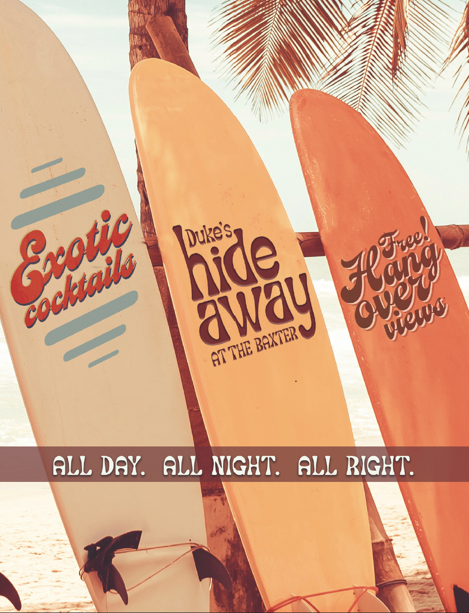
The Hideaway is the place for relaxed drinks with Surfside vibes. Street Studio helped develop branding elements including logos and messaging that capture the essence of the fresh and fun space.
Street Studio’s Role
For The Hideaway, Street Studio had the opportunity to go all-in on creativity, crafting a brand identity that feels bold, expressive, and unapologetically retro. Inspired by the groovy, funky aesthetic of the 1970s, we developed a playful yet edgy brand that resonates with the city’s most vibrant crowd.
Key Creative Elements
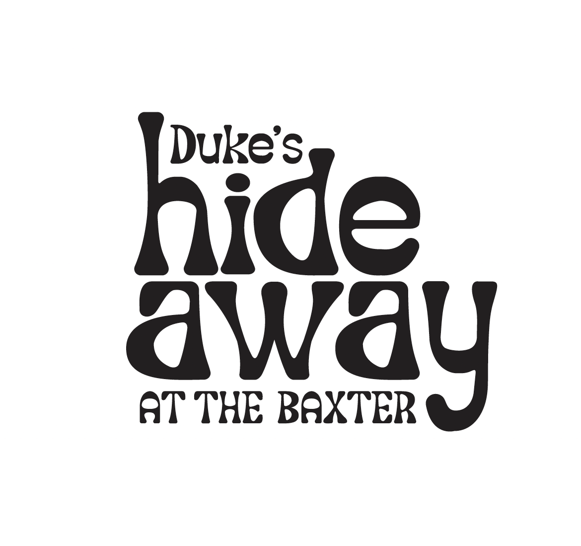
Logo & Typography: Designed a wavy, stylized font that captures the free-spirited, funky energy of the 70s, with a mix of retro letterforms and bold, psychedelic-inspired shapes.
Iconography & Visual Accents: Created a suite of vintage-inspired symbols, including lightning bolts, flower-power florals, peace signs, and psychedelic lips, reinforcing the brand’s playful, rebellious edge.
Brand Voice & Copywriting: Infused the brand’s messaging with 70s slang and hipster-style phrases, using words like "Groovy," "Foxy," and "Totally Rad" to give the copy a bold, fun, and memorable personality.
Color Palette & Design Approach: Built a visually dynamic identity that embraces bold color contrasts, trippy patterns, and energetic layouts, ensuring The Hideaway feels like a time warp to a cooler, funkier era.
The Result
The Hideaway is more than just a bar—it’s an experience. By leaning into full-on creative freedom, we developed a highly stylized, retro-cool brand that perfectly aligns with Atlanta’s Beltline culture. The playful visuals, nostalgic typography, and cheeky brand voice make The Hideaway an irresistibly fun, go-to destination for a seriously good time.